Typography of Chernobyl
At the beginning of June, we were lucky enough to spend two days in the Chernobyl exclusion zone! Apart from the stock standard creepy dead-eyed dolls and abandoned fairground equipment that everyone loves to photograph, I was really excited about all the cool examples of Soviet era typography. The touches of decay just sealed the deal for me.
Take a look at my favourites!
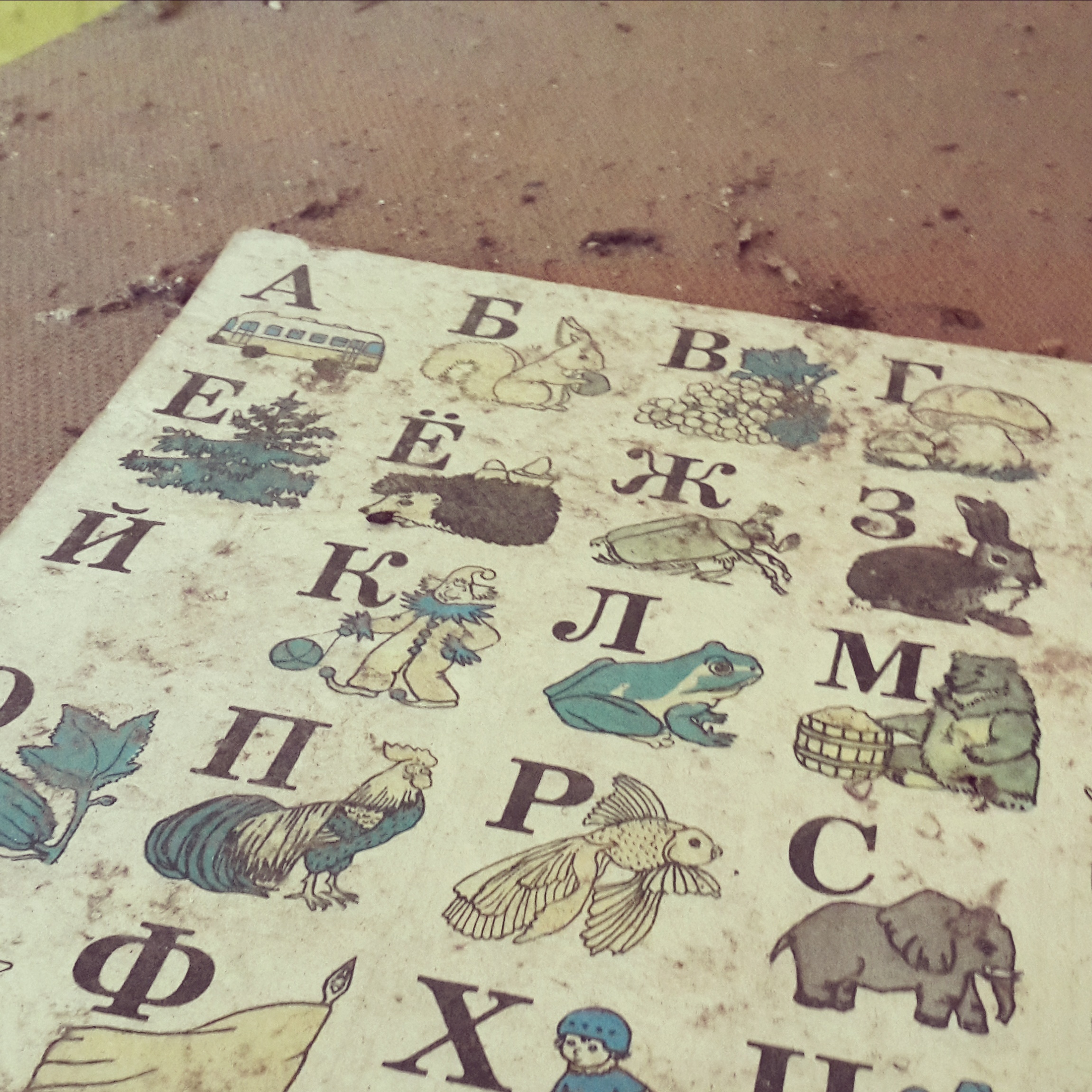
Look at the terminal of that K. It makes me want to weep.

The wonky combination of curves and angles here is just so great.
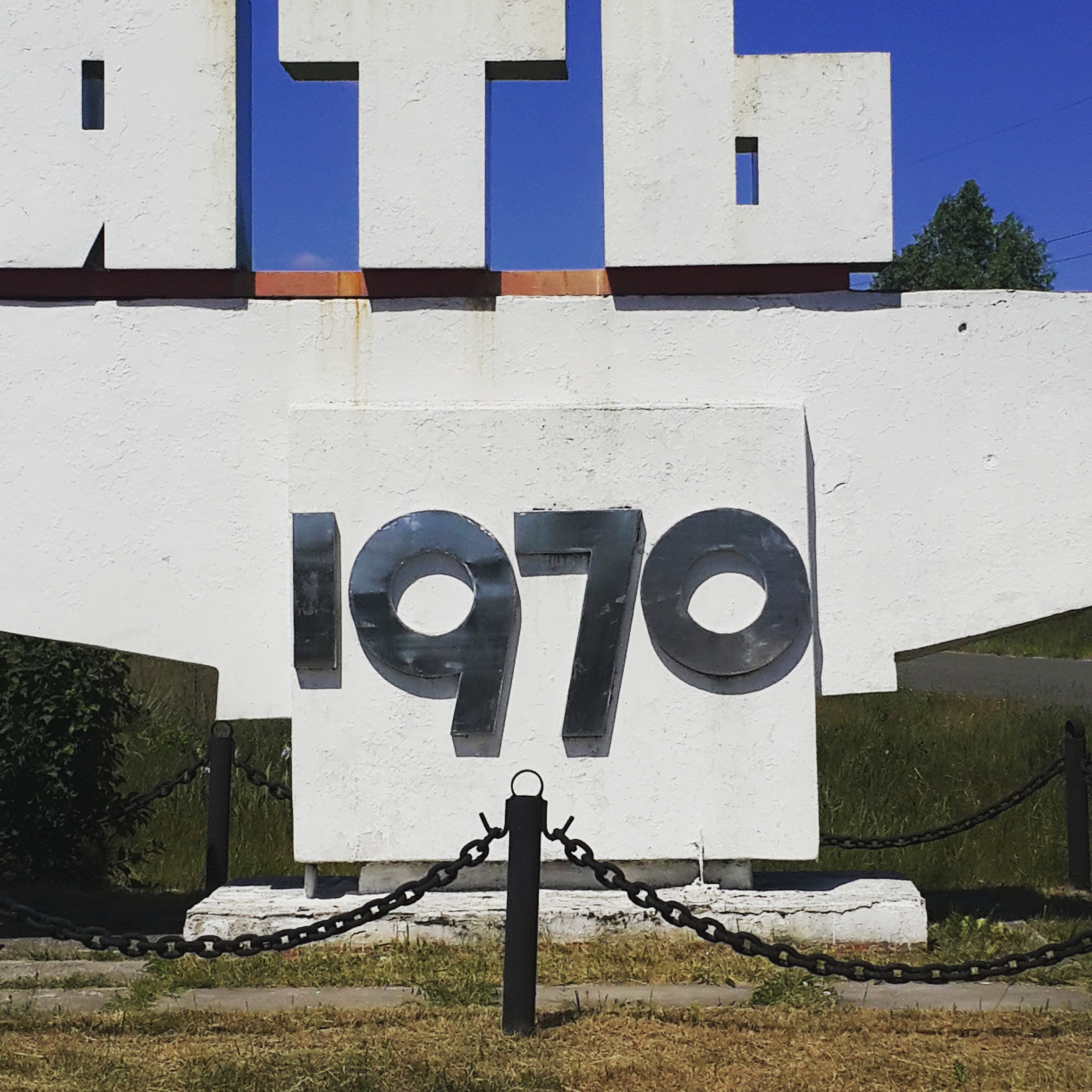
Perfect geometry!

The subtle texture here was obviously not intended, which makes me like it even more.

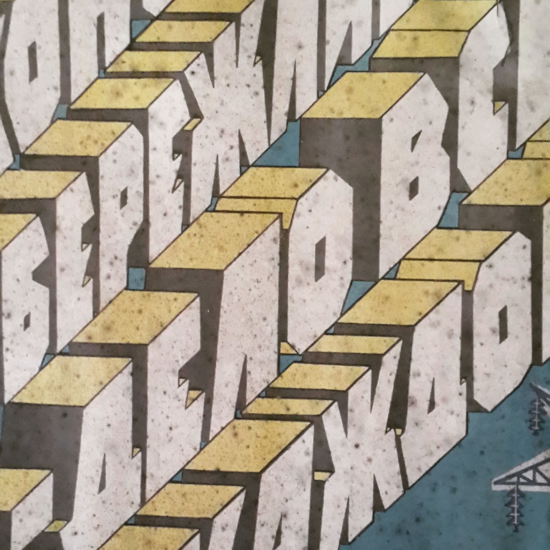
Strong angles, aww yiss.
EXACTLY what I picture when I think about Soviet era design.

STENCIL :')
That K is too lovely. Someone turn this into a font.
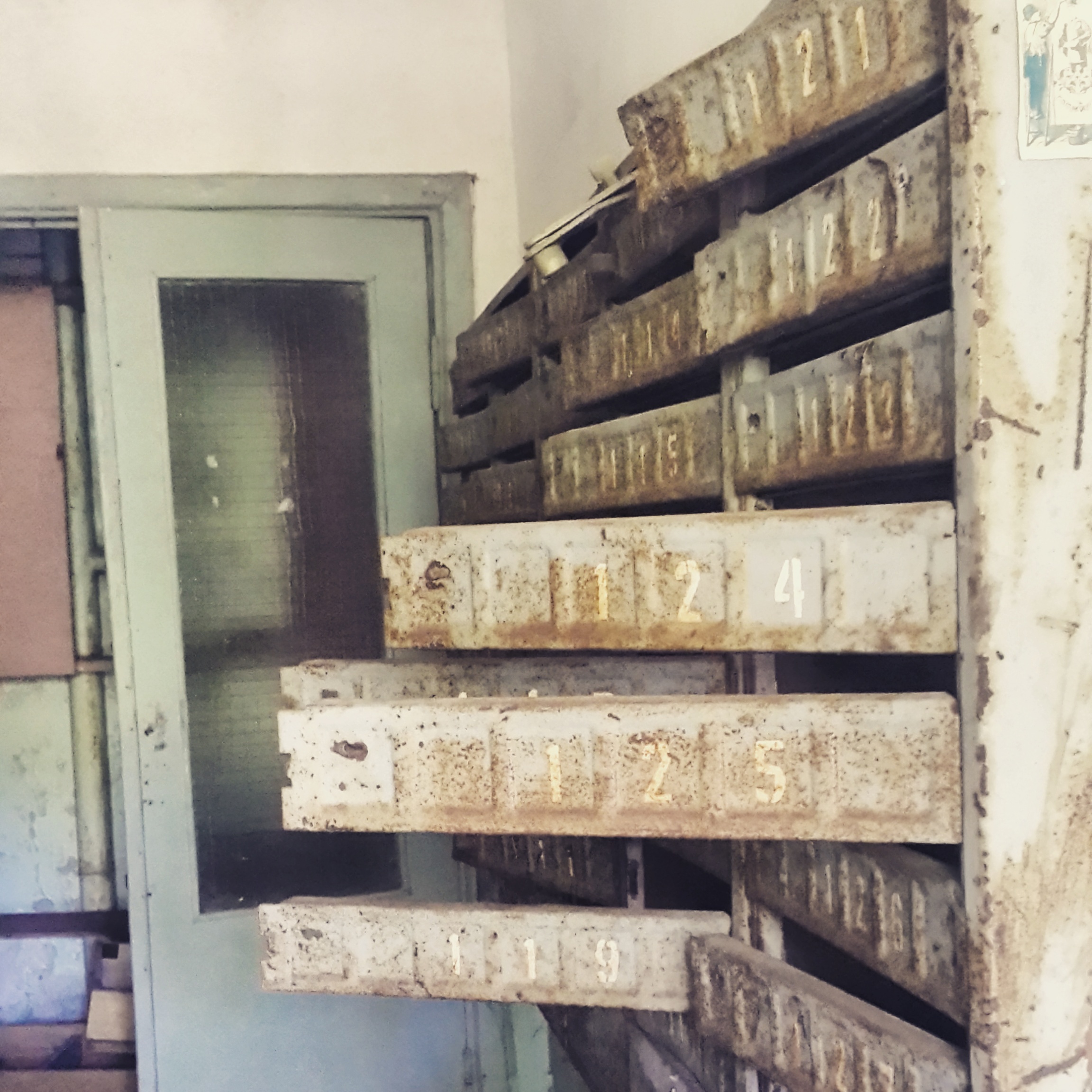
More stencil!

Baie Soviet. Lekker.
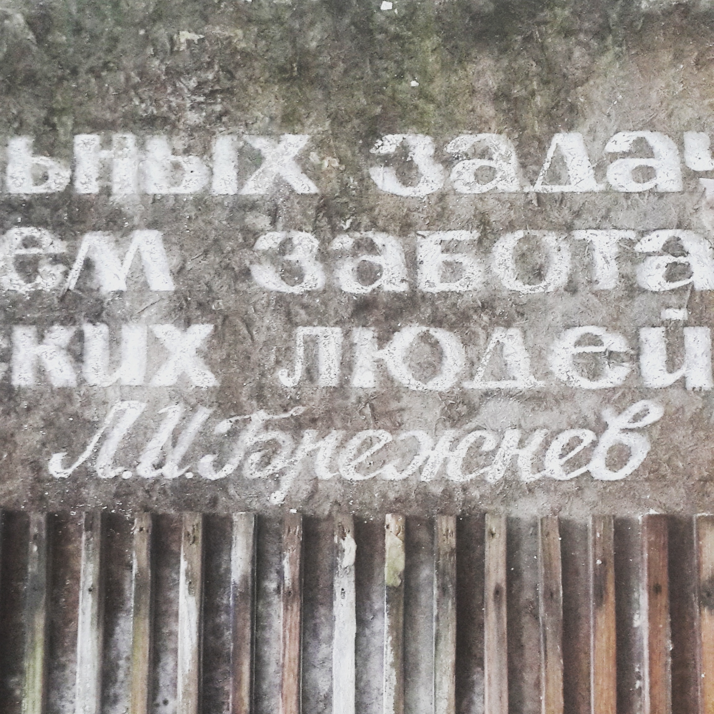
The contrast between the all caps and the swishy script gives me... feelings.

<3
If you liked this, take a look at Patterns of Chernobyl and Floors of Chernobyl.